BrandPilot
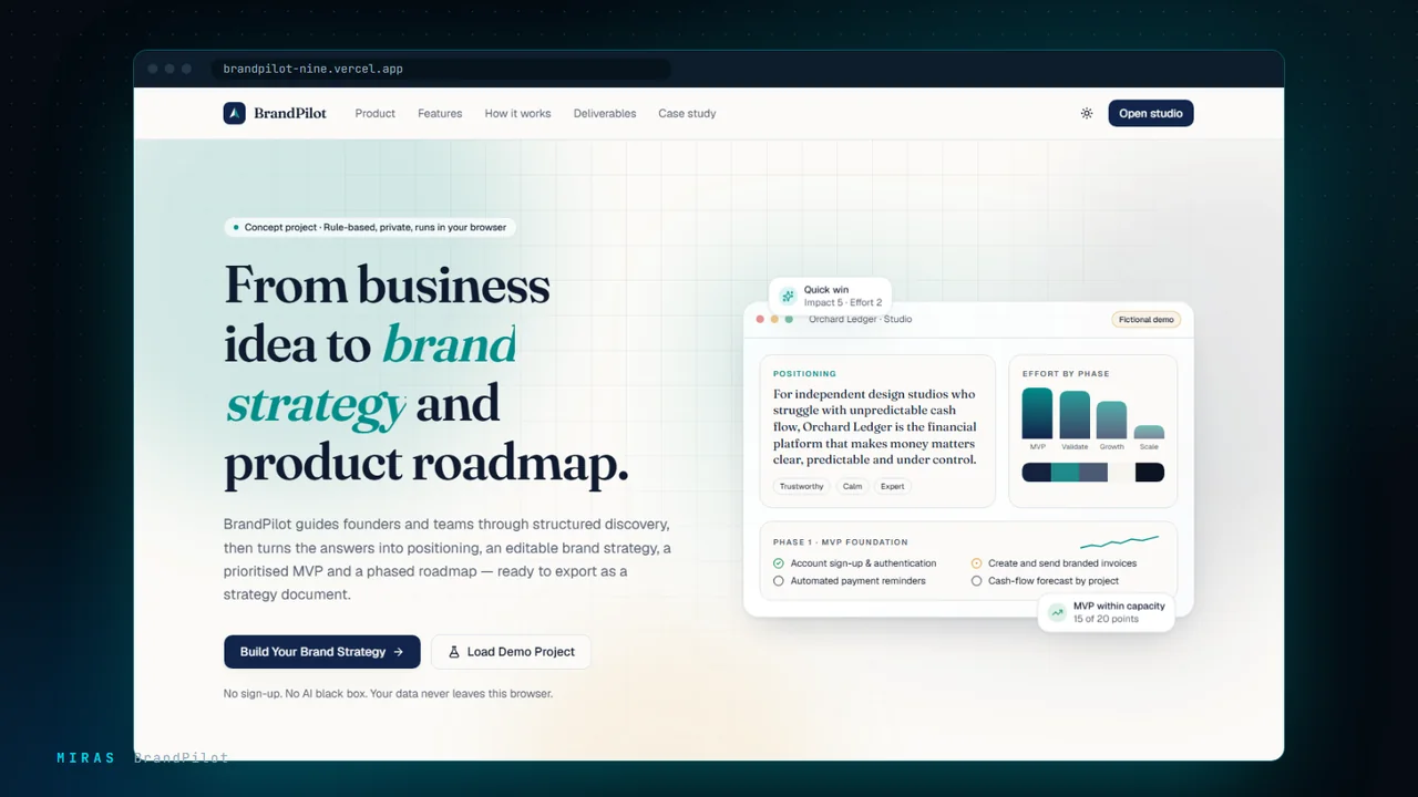
Brand and product strategy studio, web and Android
Turns a business idea into a brand strategy, a prioritised MVP and a product roadmap, on the web and on Android.

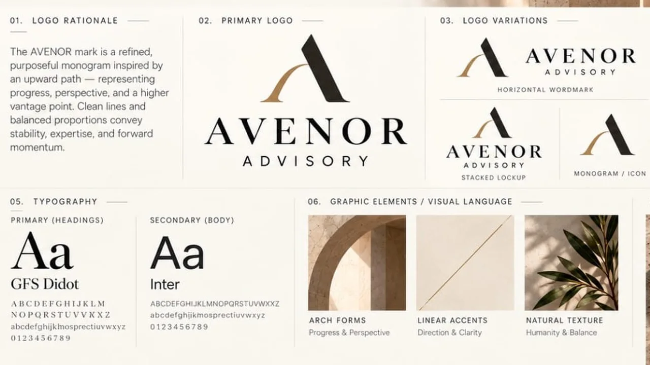
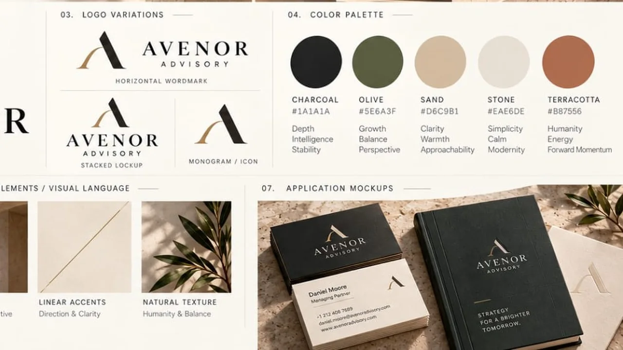
A visual identity for an advisory firm: an upward monogram, a quiet palette of charcoal, olive and terracotta, and a graphic language of arches and linear accents.
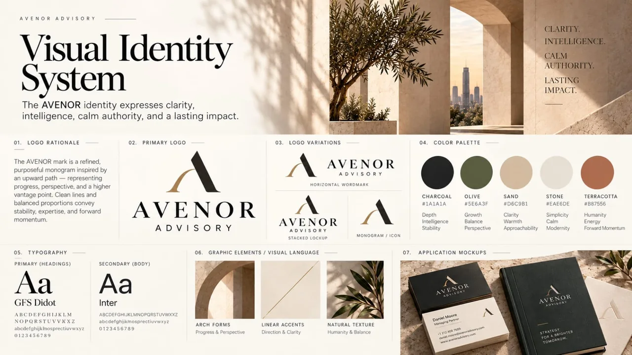
AVENOR Advisory's identity expresses clarity, intelligence, calm authority and lasting impact. Its monogram is an upward path, read as progress, perspective and a higher vantage point. The system sets a palette of charcoal, olive, sand, stone and terracotta, GFS Didot with Inter, and a visual language of arch forms, linear accents and natural texture.
An advisory firm sells judgement, so its identity has to feel measured rather than loud. The brand needed a mark and palette that signal calm authority on print and digital.
A restrained system: a monogram with a primary wordmark, horizontal and stacked lockups, five named colours with their meanings, arch and linear graphics, and applications on business cards and notebooks.
Brand and product strategy studio, web and Android
Turns a business idea into a brand strategy, a prioritised MVP and a product roadmap, on the web and on Android.
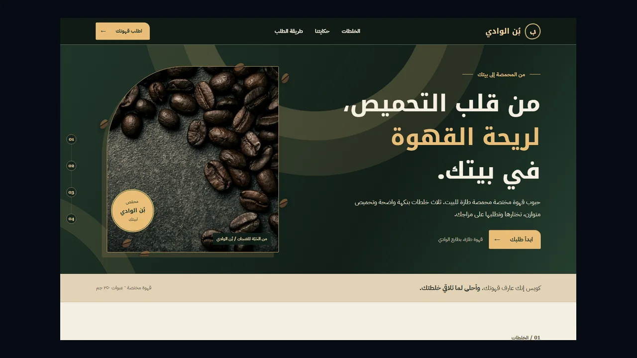
Arabic specialty coffee brand website
An Arabic-first brand site for a specialty roastery: three signature blends with clear prices, the roastery story and an order request sent for review.
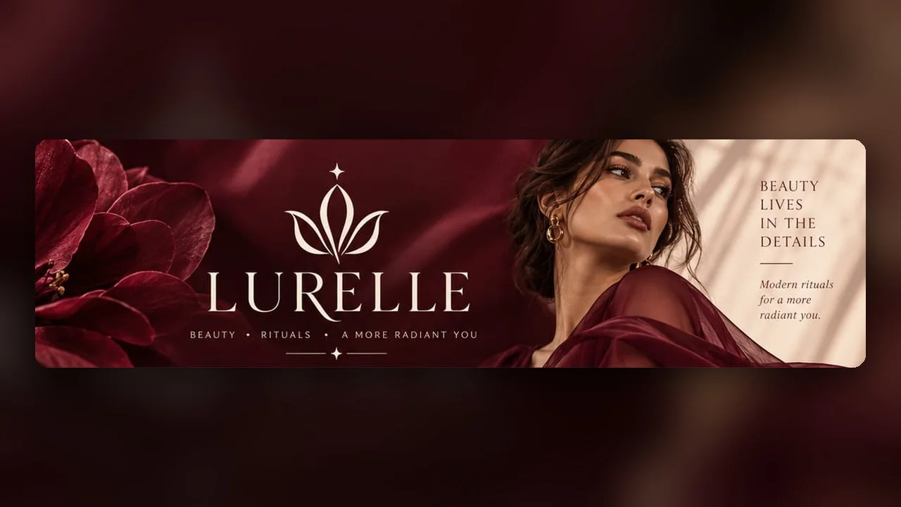
Beauty brand identity system
A beauty identity in wine, rose and gold: a logo family, a restrained palette and a type pairing that carry from shopfront to skincare packaging.
Tell us where you are starting. We reply with the simplest sensible scope.
Start a project